
Note: This is an older post which was migrated to Ghost.
iOS 6 has been out for about a week now and as some of you might have noticed, Apple changed the appearance a lot of the ‘baked in’ apps, such as the App Store, iTunes Store and the Music Player. Those changes also include customized tab bars, instead of the default styling which they previously had in iOS 5 and below.
Before iOS 5, customizing controls was kind of a pain, especially a more sophisticated contol, such as a tab bar or segmented control. Restyling such elements ment you basically had to re-write the code to do so, from scratch.
Since the launch of iOS 5, we’ve had access to the appearance proxy, which makes styling components in UIKit a whole lot easier and (way!) less time-consuming. Yet, because the appearance proxy isn’t backwards compatible with iOS 4, actually using it wasn’t really a viable option. Now that iOS 6 has been released and users still on iOS 4 are beginning to run scarse, it can actually serve us quite well.
So, I thought I’d show you how you could use the appearance proxy to customize the default UITabBar. In this case we’ll be using a UITabBarController, since that’s what most of you’ll probably be using anyway.
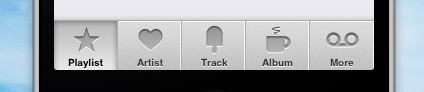
Our finished tab bar will (or should) look like this; A (non pixel-perfect) clone of the tab bar found in the new Music Player on iPhone in iOS 6.
Getting started
Whip open Xcode, create a new project and give it a name. Also, make it a window-based app.
You’ll need to import the images into your project. I just lifted off the icons and saved those separately, just like the tab bar background, and the selection image. You’ll end up with these images (.zip file).
Alternatively, you could create seperate ‘highlighted’ icons for each of the tabs. Since we’re trying to mimic the look of iPhone’s music app, we won’t be using alternative icons for the tab’s highlighted state. It will get clearer once we put this into code.
For the purpose of keeping it simple, we’ll be writing our code inside the applicationDidFinishLaunchingWithOptions: method. This isn’t necessarily best practise, but it seems redundant to create five seperate viewcontrollers. You’d normally put the logic for each tabbar item in the corresponding view controller. Also note that as a result of the visual segments we added to the tab bar background image, the tab bar will not draw propertly in landscape mode.
We’ll be using the UITabBarController component, which expects to be given one or more view controllers. These view controllers in turn have a proberty called tabBarItem, which is an instance of UITabBarItem. The tab bar controller basically asks each view controller for to give it an item to display. If you don’t create one manually and give it to the view controller, one is created autoamtically - although it lacks an icon and also a title. You can either initialize a new UITabBarItem, or lazily load one and change it’s properties. We’ll be taking the latter approach.
Creating the view controllers and tab bar items
So, lets create the view controllers. Each of these view controllers already has a property with the name ‘tabBarItem’, which will (lazily) return an instance of UITabBarItem. We’ll set some properties on this object to change it’s appearance, so that when the tab bar controller requests this item, it will recieve our customized item.
NSArray *titles = @[@"Playlist", @"Artist", @"Track", @"Album", @"More"];

NSMutableArray *viewControllers = [NSMutableArray arrayWithCapacity:5];

for (uint i = 0; i < 5; i++) {
    UIImage *tabImage = [UIImage imageNamed:[NSString stringWithFormat:@"icon%i", (i+1)]];

    UIViewController *viewController = [[UIViewController alloc] init];
    [viewController.view setBackgroundColor:[UIColor lightGreyColor]];
    [viewController.tabBarItem setTitle:[titles objectAtIndex:i]];
    [viewController.tabBarItem setFinishedSelectedImage:tabImage withFinishedUnselectedImage:tabImage];

    [viewControllers addObject:viewController];
}
Pay special attention to the setFinishedSelectedImage:withFinishedUnselectedImage: message sent to the UITabBarItem instance. We’re using this method instead of just setImage:, because images set via setImage: are treated and colored by the OS, and that’s not what we want to happen. Also, we’re using the same icon image for both the normal state and selected state of the tab, because this is simular to the way the tab bar behaves inside the music app.
Lastly, each view controller will be added to an array, which will be given to the tab bar controller later on.
Styling the tab bar
Changing the tab bar background is dead-easy. We’ll also be setting the selection indicator image. The difference between the two, besides having different purposes, is that the first covers the whole width of the tabbar, as where the selection indicator image just covers one tab - the tab that is selected.
[[UITabBar appearance] setBackgroundImage:[UIImage imageNamed:@"tabbar_bg.png"]];
[[UITabBar appearance] setSelectionIndicatorImage:[UIImage imageNamed:@"tabbar_selection.png"]];
Now it’s time to create the tab bar controller. We’ll pass it the view controllers we created earlier. Also, we’ll tell it to select the first tab.
UITabBarController *tabBarController = [[UITabBarController alloc] init];
[tabBarController setViewControllers:viewControllers];
[tabBarController setSelectedIndex:0];
Everything should work just fine, except the text color. The default text color is light grey, and white when a tab is selected. This doesn’t match our design, so we’ll change that. Again, we’ll use the appearance proxy. This time though, it a bit less straight-forward, because the method expects an NSDictionary. We’ll create two dictionaries for both states - the normal state and highlighted state.
NSDictionary *normalState = @{
    UITextAttributeTextColor : [UIColor colorWithWhite:0.213 alpha:1.000],
    UITextAttributeTextShadowColor: [UIColor whiteColor],
    UITextAttributeTextShadowOffset: [NSValue valueWithUIOffset:UIOffsetMake(0.0, 1.0)]
};

NSDictionary *selectedState = @{
    UITextAttributeTextColor : [UIColor blackColor],
    UITextAttributeTextShadowColor: [UIColor whiteColor],
    UITextAttributeTextShadowOffset: [NSValue valueWithUIOffset:UIOffsetMake(0.0, 1.0)]
};

[[UITabBarItem appearance] setTitleTextAttributes:normalState forState:UIControlStateNormal];
[[UITabBarItem appearance] setTitleTextAttributes:selectedState forState:UIControlStateHighlighted];
Let’s wrap this up!
The only thing left, is to actually show our tab bar controller, which in turn handles all the showing and hiding of the view controllers it contains. This is done by setting the tab bar controller as the root controller on the window.
[self.window setRootViewController:tabBarController];
There you have it: Your very own customized tabbar. If you have any questions or improvements, please don’t be shy to post them in the comments.